Collage as in I pasted vectors and patterns I found elsewhere into an artboard in Illustrator. All while listening to what I think of as a struggling-to-hold-on-hold-tight playlist.
I think the word 'hope' is too off-center for my liking, but then hope always is ... Originally intended to make it into a cutting template but no way am I gonna be cutting that many curves.
So someone I know launched her own studio, which is an amazing feat, and I decided a card is much faster to make than—say, an A3 cutting—because I only had maybe a week or so to work on it. (Even as a full-time bum, one week isn't a lot of time to go from conceptualizing to designing—and endless redrafts, given how quickly I change my mind about things—to buying materials, printing, and cutting (and re-cutting in the event of design or cutting mistakes), to presentation.)
This was the final product I gave:
The envelope was a simple one—Paul Jackson's angled envelope—made with tracing paper. The card design itself, lord that must've been the third of the three completely different designs I was working on.
I started out with a grid of letters ("congratulations") on a seamless pattern (which I took forever to decide on) but halfway through that, I started thinking of a variation of Cirque des Rêves (yes, based on The Night Circus) which had a circular motif and a typeface with beautiful swashes (Giza Pro).
Finally, because it was all getting overwhelming and (needlessly) complicated, I settled on this much simpler design which also meant an easier cutting time.
What I used:
Typefaces:
Hello Script ("Hazel" and "I wish you every success")
Reislust (the last two lines from Robert Crawford's 'Advice' which, fuck me, yes I didn't catch that I'd attributed it to Richard rather than Robert Crawford until I finished cutting and it's too late to reprint and re-cut. Major UGH.)
Paper: Campap watercolor paper, 300 gsm, 229x305 mm
Triangle pattern: I took a single triangle from a hand-drawn seamless pattern set then manually pasted it around (using Transform Each to rotate/copy). I thought of using the Symbol Sprayer tool but this was such a small canvas it was actually much faster to manually create the pattern than to spray, then shift/scrunch/size, etc.
Silhouette: DIY from a photo of Hazel I found in her FB album
Making this card (as well as having 10 more sheets of watercolor paper left in my block) makes me want to do more cutting! So far, I've decided to do another card—this time, one with a quote in a simple pop-up—and two seamless geometric patterns. Will get those printed out at the only print shop I'd go to since I have the time to travel there—he works with a lot of students (from the nearby art school) so he's really patient and comes at really low rates and great advice (plus free throw-ins like cutting and scoring haha)!
I found a couple of unfavorable reviews for Daawat-e-Ishq and both said something about how the romance between Gullu and Taru is unrealistic because it took place over three days. I suppose they could be right; I mean, it is wholly believable that that two people could fall in love in three days, but perhaps not as realistic that they decide to marry within/after a week of meeting. Then again, stranger things have happened.
For viewers like me, because I found the two leads so lovable, it easy to accept Gullu's and Taru's relationship (and subsequent marriage). Of course, I'd have loved to have the courtship/getting-to-know-you bit stretch a little longer. In fact, I wish the script had sacrificed the Amju-Gullu thing in favor of Taru-Gullu. Like, I didn't need to know Amju and Gullu had been crushing on each other for a month, how they appear to be diametrically different people (veggie vs non-veg). I would prefer to have more Taru-Gullu conversations.
Anyway, I still like Daawat and 'Mannat' has become my earworm du jour. (It's the somewhat incantatory nature of the chorus, I think, that I like so much.)
What's not to love about the movie, really? Besides really adorable leads, Lucknow tourism and food porn, and music, there's a whole lotta kohl. Dude wore guy-liner the whole time — even when Pari's character wasn't wearing any! Eye-liner/kohl is totally my favorite thing to see on both genders.
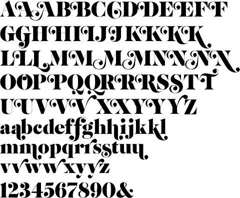
One other thing I love about Daawat: the title typeface. God, I've always been a sucker for ball (and teardrop) terminals and there are some fucking gorgeous beauties in the titles:
It looks similar to Elephant but with customized swashes. (I actually don't think this typeface was customized for Daawat; I seem to recall seeing a typeface like this before).